The Federal Reserve released its quarterly flow of funds report last week. The Fed’s flow of funds report is one of the most valuable economic data sets kept by the government. It is a treasure trove of financial information on the household, corporate, and government sectors of the economy.
The most recent report includes data through the third quarter of this year. I’ve included three charts on a couple of the more important data points in the report. All three have implications for the medium-term economic outlook.
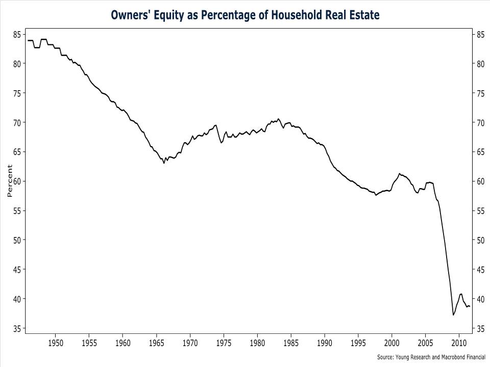
The first chart shows the percentage of equity that households have in their homes. Homeowner equity has been in secular decline for decades, but the bursting of the real-estate bubble resulted in a collapse of this ratio. Current levels of homeowner equity are bordering on record lows. And keep in mind that the ratio on this chart includes properties without a mortgage. If you count only those properties with a mortgage, the level of equity is estimated to be less than 20%. According to the most recent data from Core Logic, more than 22% of U.S. homeowners have negative equity. That is, they owe more on their home than it is worth. And another 5% have less than 5% in equity in their home.
For many Americans, their primary residence is their single largest and in some cases their only asset. With years’ worth of accumulated equity wiped out in the crash, consumers are reluctant to spend as freely as they once did. And until a meaningful amount of the equity lost in the crash is rebuilt, consumption may remain subdued.
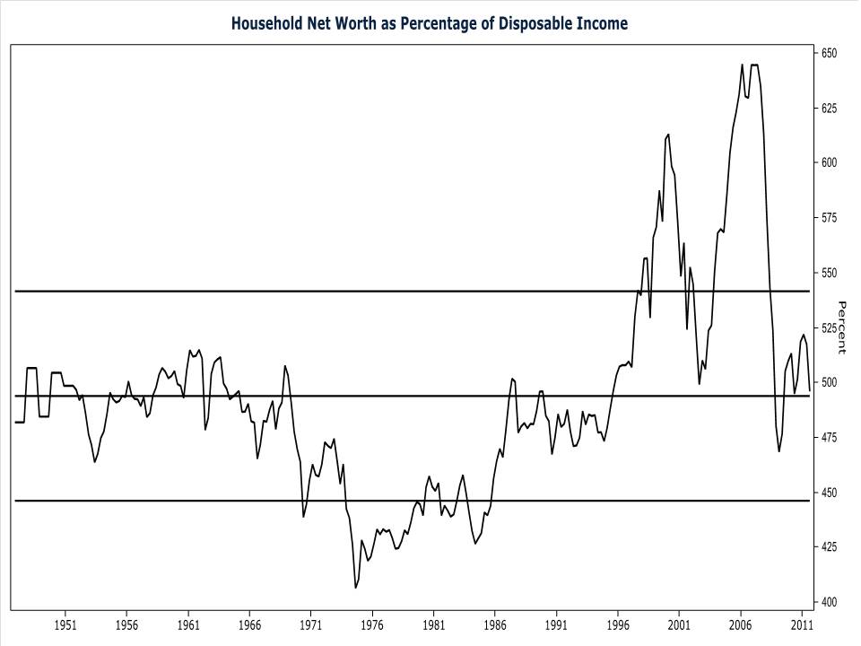
My second chart from the flow of funds report shows the ratio of household net worth to disposable personal income. Like the home equity chart above, this chart provides insight into the behavior of consumers. The ratio of household net worth to disposable income is highly correlated with the savings rate. When the ratio of net worth to income is high, as it was during the dot-com and real-estate bubbles, the household savings rate is low. And when the opposite is true, consumers save more of their income. Today the ratio of net worth to income is near its long-term average. Based on the historical relationship of the net-worth-to-income ratio and the savings rate, consumers would normally be saving about 7% of their income.
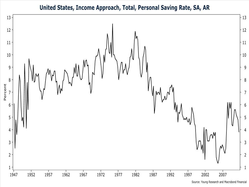
The actual savings rate, included in the next chart, is only 3.8%. Barring a meaningful and sustained rise in the ratio of net worth to income, the savings rate is likely to rise in coming quarters. A higher savings rate will come at the expense of consumer spending, and unless the corporate sector picks up the slack, economic growth will suffer.


