If you tune into to CNBC regularly, you’ve likely come across a segment where the commentators are talking about the VIX Index. You may have wondered what the significance of the VIX was and what its implications are for your portfolio. The VIX isn’t like the Dow Jones or the S&P 500—it doesn’t track the movement of stock prices. The VIX is a measure of risk. Some call it the “fear gauge.”
According to the Chicago Board of Options Exchange, the organization that publishes the index, the VIX is a “key measure of market expectations of near-term volatility conveyed by S&P 500 stock index options prices.” Stated simply, the VIX measures the market’s estimate of future stock price fluctuations.
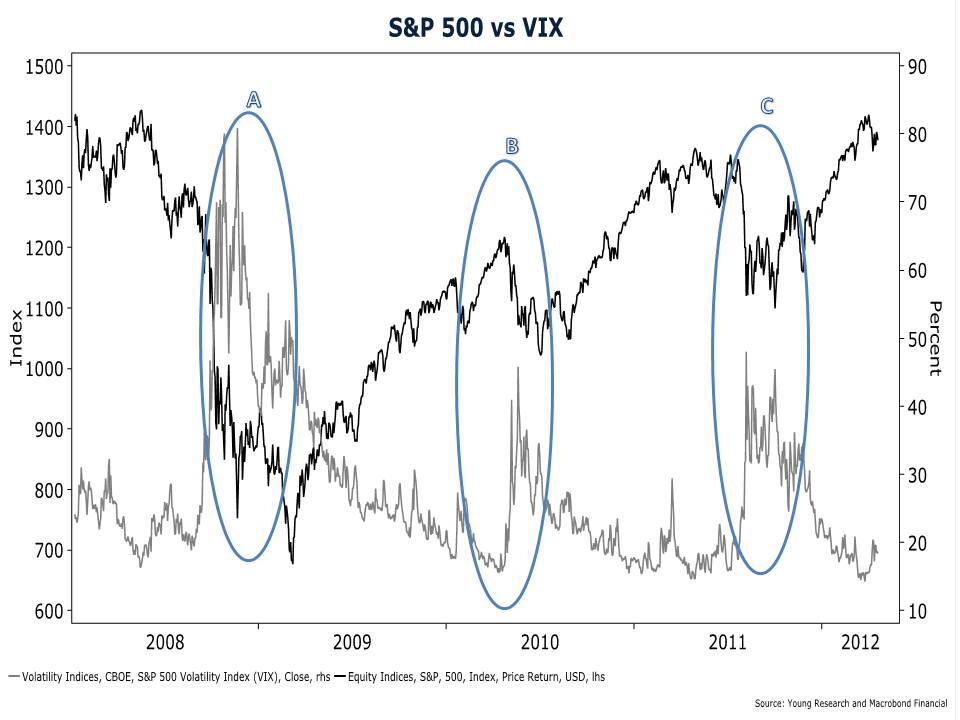
Elevated readings on the VIX indicate that investors believe stock-market risk is high, and lower readings indicate the opposite. The chart below shows the VIX (grey line) and the S&P 500 (black line) since 2008.
If you study the chart closely, you will notice that spikes in the VIX coincide with sharp drops in the S&P 500—see points A, B, and C. By surging when stocks are plunging, the VIX is essentially saying that stocks get riskier as they get cheaper.
In the heat of a bear market that shaves 10%, 20%, or 30% off of the value of the market, stocks may seem riskier, but students of Graham and Dodd would argue that cheaper stocks offer investors a greater margin of safety. And the same is true of the broader market. All else equal, buying an index fund when the market yields 4% isn’t as risky as buying an index fund when the market yields 2%.
The VIX is intended to be a measure of stock market risk, but it is best used as a contrary indicator. As Warren Buffett is fond of saying, you want to be greedy when others are fearful and fearful when others are greedy. Use the VIX as a gauge of investor fear. When the VIX spikes, it is time to go bargain hunting. And when the VIX plumbs to new lows and investor complacency is high, take a cautious approach.


