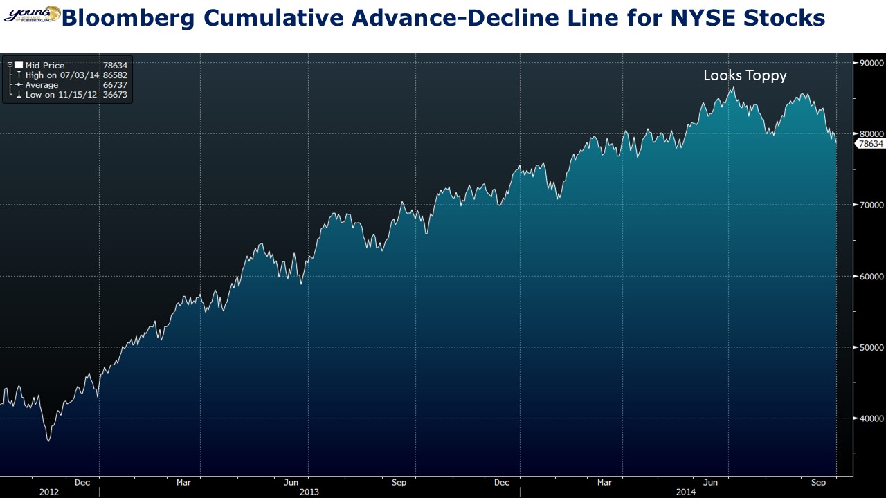
Markets internals aren’t sending a signal of optimism. My first chart below on the NYSE advance-decline line looks like it is rolling over. The advance-decline line is a measure of market breadth. A healthy uptrend in the stock market should bring along all of the troops. When the advance-decline line begins to diverge from the broader market it is a sign of a narrowing market with fewer and fewer stocks propping up the broader indices.
The second chart below shows the 5-day moving average of NYSE new lows and new highs. The number of new lows is soaring while the number of new highs is trending down.
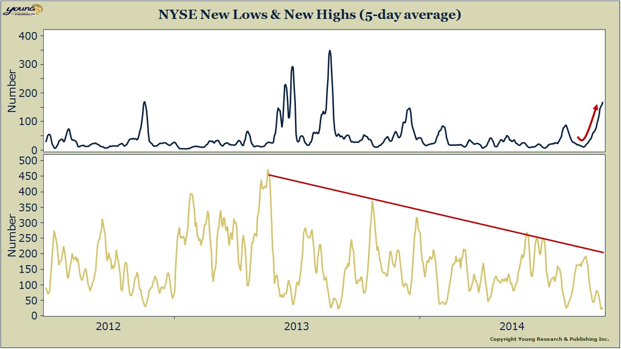
Neither indicator is a reason to panic, but both are cause for caution.


