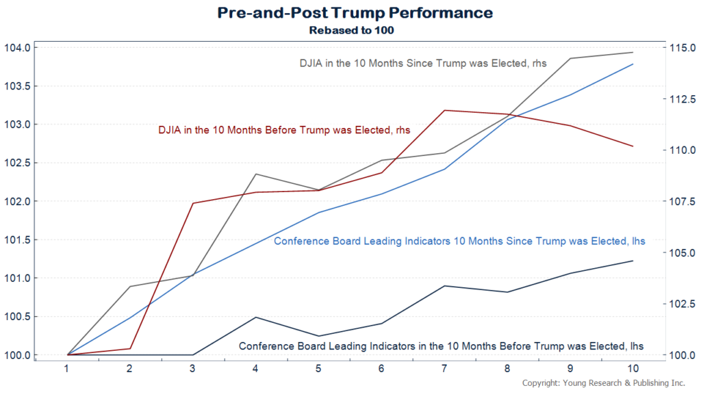
On this chart you can see what has come to be known as the “Trump Effect.”
In dark grey and light blue you can see the performance of the Dow Jones Industrial Average and the Conference Board’s Leading Economic Index after November 2016 when Trump was elected.
In red and dark blue you can see the performance of each of those indicators in the ten months leading up to the election. All the series have been rebased to 100 for comparison.
Originally posted on Youngsworldmoneyforecast.com
The following two tabs change content below.
Dick Young
Richard C. Young is the editor of Young's World Money Forecast, and a contributing editor to both Richardcyoung.com and Youngresearch.com.
Latest posts by Dick Young (see all)
- How to Avoid Wall Street’s Unshakable Attachment to Earnings - February 22, 2019
- What Are You Getting Paid? - February 15, 2019
- When You Get OLD, Things Have to Be RIGHT - February 13, 2019