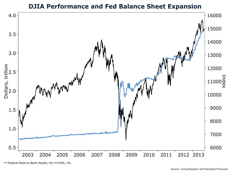
If you think the Federal Reserve’s struggle with its tapering problem is bad, stay tuned because you ain’t seen nothing yet. Take a look at my chart series below and in a matter of seconds you get a feel for exactly what the Fed has done for the stock market. There isn’t a shade of doubt about the direct correlation between the advance in the Dow Jones Industrial Average and the expansion of the Fed’s balance sheet.
The advance in stocks undoubtedly provides investors with a false sense of security. But when I walk around downtown Newport, RI it doesn’t feel like a vibrant economy to me. I know my observation is anecdotal but when I talk to clients around the country they give me a similar response about their own businesses—about flat year-over-year. And yet one truism is that our expenses seem to always go up.
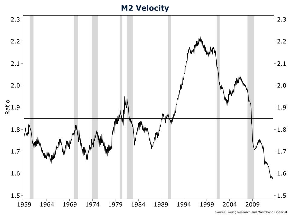
What’s truly unsettling about this next chart is that we’re dealing with record low velocity of money. Wait until velocity picks up. If you think the Fed has painted itself into a corner so far then you ain’t seen nothing yet. Make sure you have a plan in place to deal with the coming destruction of money. It doesn’t have to be your undoing. And if your investable assets are around $2 million and want to speak with me directly then email me at ejsmith@youngresearch.com to get help crafting a portfolio for your specific situation.